KSP to Komplete UI
If you are used to building instrument UIs in KSP and would like to switch to Komplete Script and Komplete UI, this guide highlights similarities and differences to help you make the transition smoothly.
While KSP's scripting language handles both sound processing and UI creation in one system, Komplete UI introduces a separation of concerns:
- Komplete UI is the declarative UI framework (contained in the UI Module)
- Komplete Script is the underlying mixed imperative / declarative programming language
Understanding Imperative vs. Declarative
If KSP is your only coding experience, you might not be familiar with these terms. Here's what they mean:
-
Imperative code (like KSP) tells the computer how to do something, step by step. You write explicit instructions that execute in sequence.
-
Declarative code (like components in Komplete UI) describes what you want the result to be, and the system figures out how to achieve it.
You will find some side-by-side examples further down, in the Callbacks and Reactivity section. You can also read more about Komplete UI's declarative style on the Declarative UI page.
Komplete Script combines both approaches: you use imperative code for logic and data processing (variables, functions, loops) and declarative code for building the UI (components, modifiers, layout).
Your code will be in both cases in a file with the kscript extension, but as you will see, the syntax is specific to each approach.
Therefore throughout this guide, when discussing UI elements, we'll refer to Komplete UI. And when discussing general programming concepts like variables and functions, we'll refer to Komplete Script.
Variables
Komplete Script variables can be declared anywhere within an imperative scope, and in contrast to KSP they always have to be initialized on declaration, as there is no default value set for them.
Instead of having to provide a type label in front of the variable name, you can usually omit specifying the type as the compiler will infer it in most cases. You can specify the type name if needed by following the variable name with a colon and the type name. Find all the types we offer in the Reference.
declare $test := -1
var test_implicit = -1
var test_explicit: Int = -1 // optional explicit type
Arrays and Maps
Like with variables, arrays do not have a type label, like in KSP. Instead, the array can have any type, and the type will usually be inferred, or you can specify it in brackets. You can also define multidimensional arrays. Here is an example with an array of Integer arrays:
declare %presets[10 * 3] := ( ...
    { 1 }  8, 8, 8, 0,  0, 0, 0, 0, ...
    { 2 }  8, 8, 8, 8,  0, 0, 0, 0, ...
    { 3 }  8, 8, 8, 8,  8, 8, 8, 8  )
var presets = [
    [8, 8, 8, 0, 0, 0, 0, 0],
    [8, 8, 8, 8, 0, 0, 0, 0],
    [8, 8, 8, 8, 8, 8, 8, 8]
]
As you probably noticed, you also do not need to set a size for the array, it can grow dynamically. You can always append or insert in an array:
var presets: [[Int]] = [[]] // specifying the type is required when initializing with an empty array
presets.append([0, 0, 5, 3, 2, 0, 0, 0])
Komplete Script also introduces Maps, another data type for storing collections. Maps have no equivalent in KSP. While in arrays you access elements by index, maps let you look up values by keys. This is especially useful when you want to store and retrieve data efficiently as unique key-value pairs, rather than having to remember which array index corresponds to what value.
Here's an example using maps to organize preset data:
var preset_data = [
    "Init": ["cutoff": 100, "resonance": 0, "drive": 0],
    "Warm": ["cutoff": 80, "resonance": 20, "drive": 15],
    "Bright": ["cutoff": 80, "resonance": 40, "drive": 5]
]

var warm_preset = preset_data["Warm"] // a map lookup always returns an optional element, since its value can be nil if no match was found
if warm_preset != nil { // the optional element is checked against nil
    var cutoff = warm_preset!["cutoff"] // the optional element is unwrapped with "!" to get its value
}
Functions
Use fun to declare a function, and call it by using the function name.
function do_something()
    { function body }
end function

call do_something
fun do_something() {
    //function body
}

do_something()
Function arguments and one or more return values are supported:
fun split_name(full_name: String) -> (String, String) {
    var parts = full_name.split(separator: " ")
    return parts[0], parts[1]
}

var first_name, last_name = split_name(full_name: "Maria Philipps")
When the return statement in a function is executed, it will exit the function and return control to the calling function, like exit in KSP. However, return can also return values from the function, like shown above.
You can find out more about function features in the Language Tour.
Entry point
In Komplete UI there is no on init callback. The main Komplete UI module you link in Instrument Options runs when the instrument loads, so that will contain the entry point to the instrument's code. Its scope is similar to on init, so if you define variables and run functions in this file, these statements will be executed once, when the instrument loads.
It's important to note that in this main module you always need to export the main UI component. There needs to be a user interface element exported for your UI to be valid:
import { Text } from ui

export var main = Text("Hello World") // exporting a UI component is required in the main module
Project structure
With Komplete UI, you can organize your instrument code in as many modules(files) you want. There is no restriction similar to the number of script slots. This means you can modularize code for reusability without any constraints.
All your Komplete UI code for an instrument needs to be placed in the Resource Container of that instrument, in the komplete_scripts folder. From that reference location, you can import any of your modules. You can find more details on how modules import and export works in the Language tour.
UI elements
Like KSP, Komplete UI comes with built-in UI elements. In Komplete UI these are called Components. To use UI components, and other features offered by the UI Module, you need to import it in your kscript file.
import * from ui
You will notice that between the Komplete UI components and KSP User Interface Widgets (or Controls) there is not a one-to-one correspondence. Komplete UI offers much more basic components (like Rectangle, and Text), which you can compose to build other components which look like Kontakt UI Controls (like a button). This brings a lot of flexibility in how you can shape the look of the UI.
The Kontakt Module allows you to connect Komplete UI components to KSP UI controls. In general, the Komplete UI framework uses UI Controls as a communication touch point, so you will always need a KSP UI control connected to your Komplete UI component if the data for it needs to come from KSP. In fact all data exchange from the UI to the Kontakt Engine is currently done through this interface.
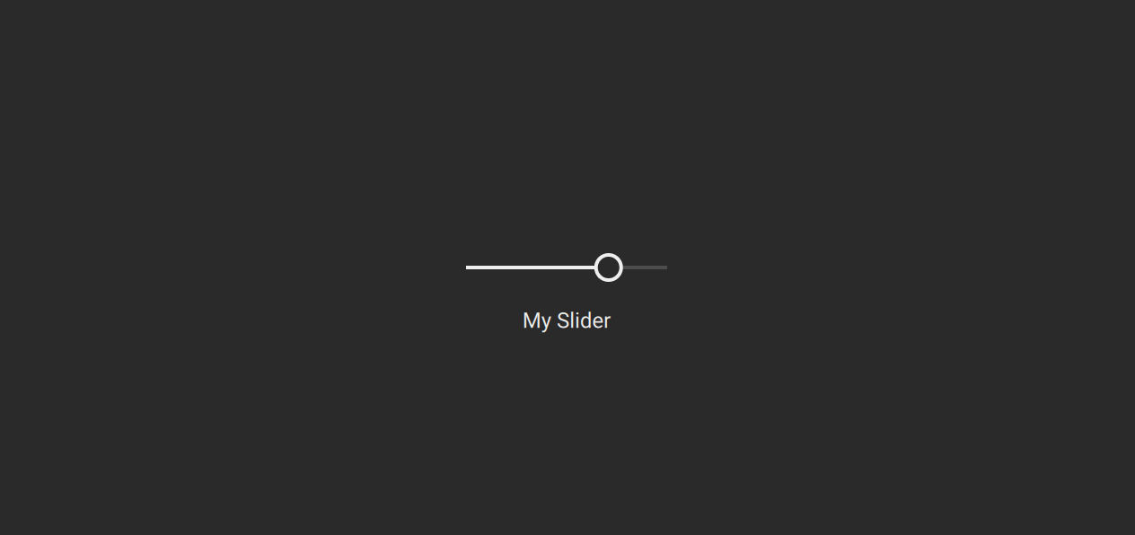
For a quick way to get started, we've built the Kontakt Controls Package, which contains components equivalent to some of the KSP UI controls, and come with a baked-in connection API to KSP UI controls. It is not part of the framework, but an optional package which you can download and use in your instrument. Here is an example which uses a Komplete UI Slider, which connects to KSP through ui_slider:
import * from ui
import * from kontakt_controls

export component Main {
    ZStack {
        // Background
        Rectangle(color: Color(0xFF2A2A2A))

        Slider(
            control_id: "my_slider", // the id of the KSP ui control
            label: "My Slider",
        )
    }
}

export var main = Main()
on init
    declare ui_slider $my_slider (0, 100)
    set_control_par(get_ui_id($my_slider), $CONTROL_PAR_DEFAULT_VALUE, 0)
    expose_controls
end on
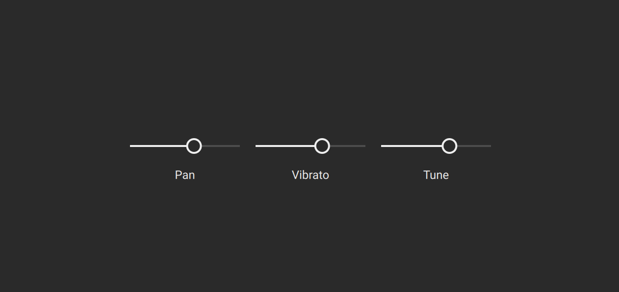
An addition in Komplete UI is the declarative for loop, which you can use to add more UI components in a hierarchy:
import * from ui
import * from kontakt_controls

export component Main {
    ZStack {
        // Background
        Rectangle(color: Color(0xFF2A2A2A))

        HStack {
            for text in ["Pan", "Vibrato", "Tune"] {
                Slider(
                    control_id: text,
                    label: text,
                )
            }
        }
    }
}

export var main = Main()
on init
    declare ui_slider $Pan (0, 100)
    set_control_par(get_ui_id($Pan), $CONTROL_PAR_DEFAULT_VALUE, 0)
    declare ui_slider $Vibrato (0, 100)
    set_control_par(get_ui_id($Vibrato), $CONTROL_PAR_DEFAULT_VALUE, 0)
    declare ui_slider $Tune (0, 100)
    set_control_par(get_ui_id($Tune), $CONTROL_PAR_DEFAULT_VALUE, 0)
    expose_controls
end on
Callbacks and Reactivity
If you've used KSP, you're already familiar with callbacks - they're the sections starting with on like on ui_control, on ui_update, or on init. A callback is code that automatically runs when a specific event occurs, like when a user interacts with a control.
While in KSP callbacks are global, in Komplete UI callbacks are attached directly to specific components, so each component knows what to do when interacted with. So in Komplete UI, components respond to events through callback properties.
Some Components (like Canvas) and some Modifiers (like DragGesture) have predefined callbacks. You can also define callbacks to react to user input in your own Components and Modifiers by creating function properties.
Note that Komplete UI is declarative, so there will be a paradigm shift in how you express the user interface from the imperative way of KSP. From global callback functions that check which control triggered them, now you have callbacks defined directly on components/modifiers to define what should happen for them specifically.
on init
    declare ui_text_edit @label_name

    set_control_par_str(get_ui_id(@label_name), $CONTROL_PAR_TEXT, "Edit me")
end on

on ui_control (@label_name)
    message(@label_name & " it is!")
end on
import { TextInput } from ui

export component Main {
    text: String = "Edit me"

    TextInput(self.$text, on_submitted: fun () {
        print("\{self.text} it is!")
    })
}

export var main = Main()
Another difference is that instead of manually updating elements, in Komplete UI you describe what the UI should look like based on a state, and the system automatically updates the UI when the state changes. This is called reactivity, and it eliminates the need to write update logic manually.
The following example illustrates reactivity. Notice how the "Syncing..." label is set in a declarative way in Komplete UI, so you don't need to explicitly specify the case when it should not be displayed:
on init
    make_perfview
    set_ui_height(2)
    declare ui_button $sync_button
    $sync_button := 0
    set_text($sync_button, "Sync")

    declare ui_label $info (1, 1)
    set_text($info, "Syncing...")
    move_control($info, 1, 2)
    set_control_par(get_ui_id($info), $CONTROL_PAR_HIDE, $HIDE_WHOLE_CONTROL)
end on

on ui_control($sync_button)
    { we have to repeat the initial state }
    if ($sync_button = 0)
        set_control_par(get_ui_id($info), $CONTROL_PAR_HIDE, $HIDE_WHOLE_CONTROL)
    { we have to manually update the property when the button state changes }
    else
        set_control_par(get_ui_id($info), $CONTROL_PAR_HIDE, $HIDE_PART_NOTHING)
    end if
end on
import * from ui

component Button {
    @binding syncing: Bool
    Text("Sync") with {
        Padding(5)
        Background {
            Rectangle(color: self.syncing? Color(0x30000000) : Color(0x70000000), radius: 2)
        }
        TapGesture(fun (event) {
            self.syncing = not self.syncing
        })
    }
}

export component Main {
    syncing: Bool = false

    VStack {
        Button(syncing: self.$syncing)

        // if the state is updated to false, the UI is automatically updated to reflect the change of state and not display this Text component
        if self.syncing {
            Text("Syncing...")
        }
    }
}

export var main = Main()
Layout
Komplete UI comes with a layout system, aimed at arranging the UI components in an intuitive way, without having to place each component manually at a certain position in pixels. Komplete UI offers a series of container components which can be used to arrange components vertically - VStack, horizontally - HStack or on top of each other - ZStack. So for example if you have a few knobs in a row, you can wrap them in an HStack for a horizontal arrangement.
import * from ui
import * from kontakt_controls

component Bar {
    HStack(spacing: 10) {
        Knob(
            control_id: "attack",
            label: "Attack",
        )
        Knob(
            control_id: "decay",
            label: "Decay",
        )
        Knob(
            control_id: "sustain",
            label: "Sustain",
        )
        Knob(
            control_id: "release",
            label: "Release",
        )
    }
}
If you want, you can still position elements using absolute coordinates with the Position modifier within a ZStack. This is similar to organizing KSP controls in a ui_panel. As you would set CONTROL_PAR_POS_X and CONTROL_PAR_POS_Y in KSP to place controls inside a panel, you can set set the position of a ZStack, as well as within the ZStack:
on init
	make_perfview
	set_ui_height(6)
	declare ui_panel $panel_of_controls
	declare $panel_id := get_ui_id( $panel_of_controls )

	{move the panel}
	set_control_par( $panel_id, $CONTROL_PAR_POS_X, 100 )
	set_control_par( $panel_id, $CONTROL_PAR_POS_Y, 20 )

	declare ui_knob $attack (0, 1000, 1)
	declare $attack_knob_id := get_ui_id( $attack )
	set_control_par( $attack_knob_id, $CONTROL_PAR_PARENT_PANEL, $panel_id ) {place control in panel}
	set_control_par( $attack_knob_id, $CONTROL_PAR_POS_X, 0 ) {move control inside of panel}
	set_control_par( $attack_knob_id, $CONTROL_PAR_POS_Y, 0 ) {move control inside of panel}

	declare ui_knob $decay (0, 1000, 1)
	declare $decay_knob_id := get_ui_id( $decay )
	set_control_par( $decay_knob_id, $CONTROL_PAR_PARENT_PANEL, $panel_id )
	set_control_par( $decay_knob_id, $CONTROL_PAR_POS_X, 100 ) {horizontal stacking}
	set_control_par( $decay_knob_id, $CONTROL_PAR_POS_Y, 0 )
end on
import * from ui
import * from kontakt_controls

component Bar {
    ZStack {
        Knob(
            control_id: "attack",
            label: "Attack",
        ) with {
            Position(x: 0, y: 0) //position knob inside ZStack
        }
        Knob(
            control_id: "decay",
            label: "Decay",
        ) with {
            Position(x: 50, y: 0) //horizontal stacking
        }
    }
    with {
        Frame(width: 200, height: 70) // set ZStack size
        Position(x: 100, y: 20) // position ZStack inside instrument UI
    }
}
Note that the instrument UI size is set for Komplete UI instruments inside Instrument Options -> Instrument. There is also no need to make a performance view anymore.