Language Tour
Komplete Script is the programming language for building Kontakt instruments — both the user interface and the instrument's business logic. When you create an instrument in Kontakt, the visual interface (knobs, sliders, labels, menus) and the logic that drives it are written in Komplete Script. It works alongside KSP (Kontakt Script Processor), Kontakt's real-time language that handles low-level MIDI event processing and audio engine interaction. Think of KSP as the engine room and Komplete Script as everything built on top of it. The language is type-safe and combines two styles. You write your instrument's business logic imperatively - with step-by-step instructions. The UI, by contrast, is declarative and reactive: you describe what the UI should look like based on your instrument's state, and Komplete Script automatically keeps everything in sync as values change. So in this latter case you don't manage updates manually - when a knob moves, any part of the UI that depends on its value updates on its own.
This tour covers the core language features you need to get started. It assumes no prior experience with Komplete Script, but familiarity with any programming language will help.
Comments
A normal line comments starts with two forward slashes (//). Everything after the two slashes will be part of the comment until the end of the line. Comments across several lines begin with /* and end in */.
var name = 5 // Can also be at the end

/*
    A comment that spans
    multiple lines.

    Can also be nested
    /*

    */
*/
Printing
Traditionally every first program should print the words “Hello, world!”. In Komplete Script this can be done with the print function:
print("Hello, world!")
// Prints Hello, world!
If you're familiar with other languages, this might seem familiar. The print function is always available and doesn't require any additional imports. In the context of Kontakt, this program cannot be used as is and requires an exported main component for the UI. To explore and test examples use the following scaffolding code.
import { Text } from ui

print("Hello, world!")
// Prints Hello, world! to Creator Tools

export var main = Text("My First Instrument")
Don't worry if you don't yet understand what import or export var main mean, both will be covered in the following sections.
Variables & Values
Use var to make a variable. A variable must always be initialized and can be reassigned.
var my_variable = 42
my_variable = 1 // assign 1 to my_variable
A variable must have the same type as the value you assign to it. However, you don't always have to write the type explicitly. The compiler can infer the type based on the assigned value. In the example above the type inferred by the compiler is Int .
If the initial value doesn't provide enough information, specify the type after the name separated by a colon (:):
var implicit_int = 42
var implicit_float = 42.0
var explicit_float: Float = 42
Except for Int, which can implicitly convert to Float, no other type can implicitly convert to another:
var my_int = 42
var my_float: Float = my_int // ok

my_int = my_float // error, not allowed
var my_str: String = my_int // error, not allowed
If you want to convert any value to a string you can use string interpolation. Simply, write the value in curly braces ({}) and put a backslash (\) in front of the opening brace:
var my_str = "\{my_int}"
Create arrays using square brackets ([]), and access their elements by writing the index in brackets. A trailing comma is allowed after the last element:
var effects = ["Phaser", "Reverb", "Delay"]
effects[1] = "Chorus" // replaces Reverb with Chorus
print("First effect: \{effects[0]}") // Prints "First effect: Phaser"
Arrays automatically grow as you add elements.
effects.append("Bit Crusher")
print("\{effects}") // Prints "[Phaser, Chorus, Delay, Bit Crusher]"
If you're assigning an empty array to a new variable or another place where there isn't any type information, you need to specify the type:
var empty_array: [Int] = []
Create maps using square brackets ([]) and separate the key with a colon (:) from the value. Access their elements by writing a key in brackets. A trailing comma is allowed:
var phone_book = [
    "Malcom": "012345",
    "Jane": "987866",
]

// update Jane's phone number
phone_book["Jane"] = "990022"

// lookup Malcom's phone number
var malcom = phone_book["Malcom"]
if malcom != nil {
    print("Malcom's phone number is: \{malcom!}")
}
else {
    print("Malcom is not in the phone book")
}
To delete an entry from a map assign nil to it:
phone_book["Malcom"] = nil
If you're assigning an empty map to a new variable or another place where there isn't any type information, you need to specify the type:
var empty_map: [String: Int] = [:]
Here's a quick overview of all standard types:
var a_bool: Bool = false // or true
var an_int: Int = 42
var a_float: Float = 42.0
var a_string: String = "Hello, world!"
var an_int_array: [Int] = [1, 2, 3]
var a_int_to_string_map: [Int: String] = [1: "A", 2: "B", 3: "C"]
Control Flow
Use if to make conditionals and for-in or while to make loops.
var individual_scores = [75, 43, 103, 87, 12]
var team_score = 0
for score in individual_scores {
    if score > 50 {
        team_score = team_score + 3
    } else {
        team_score = team_score + 1
    }
}
print("\{team_score}")
// Prints "11"
In an if statement the condition must be an expression of type Bool - this means that code such as if score { … } is an error. There's no implicit comparison against 0.
You can also use the ternary conditional expression a ? b: c after the equal-sign (=) or any place that accepts an expression:
var team_score = 10
var message = team_score > 100 ? "Congrats! You won!" : "Not enough! Maybe next time."
print("You scored: \{team_score}. \{message}")
Optionals
Sometimes you might not have a value. These values are represented by optionals. An optional value either contains a value or contains nil to indicate the absence of a value. Write a question mark (?) after the type to mark it as optional:
var maybe_string: String? = "Hello"
print("has value: \{maybe_string != nil}") // Prints "has value: true"

maybe_string = nil
print("has value: \{maybe_string != nil}") // Prints "has value: false"
Before accessing the value of an optional, you should check whether it has a value by comparing it against nil. Once you know that a value exists you can get the value by putting an exclamation mark (!) after the variable name - this is often called unwrapping.
var maybe_string: String? = "Hello"
if maybe_string != nil {
    print("we have a string: \{maybe_string!}")
} else {
    print("we have no string")
}
Unwrapping an optional that is nil will cause a runtime error.
The result of a ternary conditional expression can also be an optional:
var maybe_string: String? = 0 > 1 ? "Hello" : nil
Functions and Closures
Use fun to declare a function. Call a function by following its name with a list of arguments enclosed in parenthesis (()). Use → to separate the parameter names and types from the function's return type.
fun clip(value: Int, min: Int, max: Int) -> (Int) {
    if value > max {
        return max
    }
    if value < min {
        return min
    }
    return value
}

var result = clip(value: 42, min: 1, max: 10)
print("Result: \{result}") // Prints "Result: 10"
By default, functions use their parameter names as labels for their arguments. Write a custom argument label before the parameter name, or write _ to use no argument label.
fun clip(_ value: Int, from min: Int, to max: Int) -> (Int) {
    if value > max {
        return max
    }
    if value < min {
        return min
    }
    return value
}

var result = clip(42, from: 1, to: 10)
print("Result: \{result}") // Prints "Result: 10"
Functions that don't return anything can either use → () as return type or simply omit this entirely:
fun say(_ text: String) {
    print("Say: \{text}")
}
To return more than one value from a function, list all return types and separate all return values with a comma (,) after the return statement.
fun get_name_and_age() -> (String, Int) {
    return "Maria", 22
}

var name, age = get_name_and_age()
print("Name: \{name}, Age: \{age}") // Prints "Name: Maria, Age: 22"
Functions are first-class values, so they can be passed as arguments to other functions. The argument passed below is called a closure — an anonymous function without a name or argument labels.
fun find_index(in values: [Int], by condition: (Int) -> (Bool)) -> (Int?) {
    var index = 0
    for value in values {
        if condition(value) {
            return index
        }
        index = index + 1
    }
    return nil
}
var index = find_index(in: [10, 20, 30, 40], by: fun (value) {
    return value == 30
})
print("Index: \{index}")
For more details on argument labels, closures, nested functions, and functions as return values, see Functions in the Language Reference.
Objects and Classes
Classes are structures that can combine data (properties) and functionality (methods). Use class followed by its name to define a class. A property declaration is a name followed by a type separated with a colon (:). Methods are like functions, but without the leading fun keyword.
class Person {
    first_name: String = "Maria"
    last_name: String = "Philipps"
    age: Int = 27

    full_name: String {
        return "\{self.first_name} \{self.last_name}"
    }

    is_older(than age: Int) -> (Bool) {
        return self.age > age
    }
}
To create an instance of a class, put parenthesis (()) after the class name. Use the dot syntax to access the properties and methods of the instance.
var maria = Person()
maria.age = 34
var full_name = maria.full_name
var is_over_18 = maria.is_older(than: 18)
In this example every property has a default value, therefore we don't need to specify anything when creating an instance. If we want to use other values, we can specify the property values between the parenthesis (()).
var john = Person(first_name: "John", last_name: "Keller") // we omit age and get the default age of 27
If we didn't provide any defaults in the class definition, we would be required to provide the information when creating an instance.
You might have noticed that full_name can be used like a property, but has a different definition than first_name or last_name. This pattern is called a computed property. After the type you define a getter or both a getter and setter between the curly braces ({}).
class Navigation {
    // normal properties
    index: Int = 1
    page_count: Int = 10

    // computed read only property
    is_at_end: Bool {
        return self.index == self.page_count - 1
    }

    // computed property (can be set)
    normalized_index: Float {
        get { return self.index / (self.page_count - 1) }
        set(normalized_index) { self.index = (normalized_index * (self.page_count - 1)).to_int() }
    }
}
The self inside a class's methods or computed properties refers to the instance and provides access to all properties and methods. It is implicitly available and doesn't need to be provided manually like in some other languages.
By default, all stored properties (not computed) must be initialized when a class is created. Komplete Script generates a default constructor for every class that accepts each stored property as an argument. For more details on custom constructors, see Classes in the Language Reference.
Enumerations
An enumeration defines a common type for a group of related values. It allows you to work with these values in a type-safe way. Use enum to create an enumeration.
enum Effect {
    reverb,
    delay,
    chorus,
    flanger,
}

var selected_effect = Effect.reverb
print("Selected: \{selected_effect}") // Prints "Selected: reverb"
How Reactivity Works
Before diving into components, it helps to understand the central idea behind Komplete Script's UI model: reactivity.
In a traditional program you update the UI manually — when a value changes, you find the label that displays it and call something like label.set_text(...). As the UI grows, this becomes hard to keep correct.
Komplete Script works differently. You declare relationships: "this label's text should be the knob's value formatted as a string." When the knob changes, Komplete Script automatically re-evaluates that relationship and updates the label. You never call an update function yourself.
The mechanism that makes this work is reactive storage. Both class properties and component state are reactive. Class instances can act as data models for your instrument's business logic — when a property on a class changes, anything in the UI that reads it updates automatically. Similarly, when component state changes, any properties and expressions inside components, modifiers or templates that depend on it are re-evaluated.
This is in contrast to plain var variables, which are not reactive — assigning a new value to a var does not cause any UI update.
Components
Components are the building blocks for your UI. Similar to classes they can have properties and methods, but their semantics are quite different as you'll learn in this section. To create a component use component followed by its name:
import { Text } from ui

component Welcome {
    Text("Hello, world!")
}

export var main: Component = Welcome()
Loading this example with display the text “Hello, world!” in the middle of the user interface. Components must always contain other components to build up the UI, they cannot be empty. For our Welcome component we're using the Text component provided by the ui module.
With our first component in place, let's explore properties that enable the customization of a component's appearance or behavior. At the moment the Welcome component will always display the same text. To allow users of this component to customize the message, you need to add a property. Define a property with @property followed by its name and type.
import { Text } from ui

component Welcome {
    @property text: String

    Text(self.text)
}

export var main: Component = Welcome(text: "Hello, Komplete Script!")
Similar to classes, you refer to members of the component through self and you pass all properties as arguments when creating them. Unlike classes, you cannot refer to properties outside of a component.
var welcome = Welcome(text: "Hello")
var text = welcome.text // doesn't work
Properties allow you to let information flow from the parent to the child component. Therefore, properties are read-only and cannot be changed from within the component.
component Welcome {
    @property text: String

    // This is an internal method
    change_text() {
        self.text = "Changed" // error, not allowed
    }

    Text(self.text)
}
To let information flow upwards you can use callbacks, which are essentially function properties.
import { Text, TapGesture, TapGestureEvent } from ui

component Button {
    @property text: String
    @property action: (Bool) -> () // Callback

    Text(self.text) with {
        TapGesture(fun (event: TapGestureEvent) {
            self.action(event.modifiers.shift) // Call function property and pass information back up
        })
    }
}

component Main {
    Button(text: "Click Me", action: fun (shift_pressed: Bool) {
        print("Got clicked with shift: \{shift_pressed}")
    })
}

export var main: Component = Main()
This example already uses a modifier called TapGesture. You can ignore this detail for now as they will be explained in more depth in the next section. For now, you only need to understand that with { TapGesture(…) } allows you to receive tap events on a component.
Since properties are read-only you might wonder how they can change over time. Passing a property to a component is actually an expression. If this expression references a state it will automatically update whenever that state changes. A state is simply a name, type and initial value.
import { Text, TapGesture, TapGestureEvent } from ui

component Button {
    pressed: Bool = false

    // Text will display either "Pressed" or "Not Pressed" based on the value of self.pressed
    Text( self.pressed ? "Pressed" : "Not Pressed" ) with {
        TapGesture(
            down: fun (event: TapGestureEvent) {
                self.pressed = true // Change state to true
            },
            up: fun (event: TapGestureEvent) {
                self.pressed = false // Change state to false
            }
        )
    }
}

export var main: Component = Button()
The gestures event callbacks allow us to change the state whenever the user interacts with the Button. If you run this example you can observe how the displayed text changes when you tap down and then up on the Button.
You can also create computed state, similar to computed properties in classes.
import { Text, TapGesture, TapGestureEvent } from ui

component Button {
    pressed: Bool = false
    text: String {
        if self.pressed {
            return "Pressed"
        }
        return "Not Pressed"
    }

    // Text will display either "Pressed" or "Not Pressed" based on the value of self.pressed
    Text(self.text) with {
        TapGesture(
            down: fun (event: TapGestureEvent) {
                self.pressed = true // Change state to true
            },
            up: fun (event: TapGestureEvent) {
                self.pressed = false // Change state to false
            }
        )
    }
}

export var main: Component = Button()
Computed states allow you to organize your code in a different way.
States are internal to a component and can only be referenced by the component itself, but sometimes it can be useful to allow a child component to get control over a state. This is called a binding. To accept a binding as argument to your component use @binding followed by its name and type.
component Checkbox {
    @binding checked: Bool

    Rectangle(
        color: self.checked ? Color(0xFFFFFFFF) : Color(0x66FFFFFF)
    ) with {
        TapGesture(fun (event: TapGestureEvent) {
            // Toggle checked state
            self.checked = not self.checked
        })
    }
}
The Checkbox receives a binding to a bool that it toggles from the TapGesture. The Rectangle indicates the checked state by adapting its color. Unlike properties, a binding can be mutated by assigning to it. To pass a state as a binding to a component use a $ in front of the state's name.
component Main {
    checked: Bool = false

    Checkbox(checked: self.$checked) // Pass binding to checked state
}
Here's the complete example
import { Rectangle, TapGesture, TapGestureEvent } from ui

component Checkbox {
    @binding checked: Bool

    Rectangle(
        color: self.checked ? Color(0xFFFFFFFF) : Color(0x66FFFFFF)
    ) with {
        TapGesture(fun (event: TapGestureEvent) {
            // Toggle checked state
            self.checked = not self.checked
        })
    }
}

component Main {
    checked: Bool = false

    Checkbox(checked: self.$checked) // Pass binding to checked state
}

export var main: Component = Main()
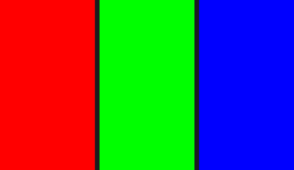
Finally, let's have a look at injecting components into others to build up hierarchies. If a component supports children, they can be injected by providing a trailing block containing all components that are supposed to be injected. For an example we use HStack which is a container component provided by the ui package that lays out its children on a horizontal line.
import { HStack, Rectangle } from ui

component Main {
    HStack(spacing: 8) {
        // Here are the children
        Rectangle(color: Color(0xFFFF0000))
        Rectangle(color: Color(0xFF00FF00))
        Rectangle(color: Color(0xFF0000FF))
    }
}

export var main: Component = Main()
Which results in this
Modifiers
A modifier you can apply to a component to produce a different version of the original value.
Modifiers are applied to a component by following it with a with block.
import { Text, Rectangle, Padding, Background } from ui

export var main = Text("I am modified") with {
    Padding(8) // Pad all sides of text equally before applying the background
    Background { // Add a red background to the text
        Rectangle(color: Color(0xFFFF0000))
    }
}

The order in which modifiers are applied matters. If we would swap Padding and Background the result would look like this.
Now the background is applied to the text directly and the padding is added after it. The same modifier can also be applied multiple times. By adding another Background after Padding we can see that Padding still applies after the first Background.
import { Text, Rectangle, Padding, Background } from ui

export var main = Text("I am modified") with {
    Background { // Add a red background to the text
        Rectangle(color: Color(0xFFFF0000))
    }
    Padding(8) // Pad all sides of text equally after applying the background
    Background { // Add a green background to the text
        Rectangle(color: Color(0xFF00FF00))
    }
}

The ui package contains plenty of modifiers for you to explore. Some affect the layout, others allow you to respond to user input gestures and more. For details on creating your own custom modifiers, see Modifiers in the Language Reference.
Import & Export
A file in Komplete Script is called a module and has the extension .kscript. Modules can export variables, classes, components, enumerations, and more, which can then be imported by other modules.
Use export in front of any declaration to make it available to other modules:
export var title: String = "Language Tour"

export class Model {
    current_page: Int = 0
}
To import from another module, use the import statement with the module name:
import { title, Model } from my_module
For full details on re-exporting, wildcard imports, namespace imports, renaming, and folder modules, see Modules in the Language Reference.
Putting It All Together
Here is a small but complete example that ties together components, state, and Kontakt integration. It builds a display for a reverb send: an arc that reflects the current knob position, a label, and a value readout — all updating automatically as the KSP knob changes.
This assumes you have a ui_knob named "reverb" defined in your KSP script, with its label set via set_knob_label. For a full reference on KSP integration, see the Kontakt Module.
import { VStack, Text, Arc, DragGesture, Padding } from ui
import { KSPKnob } from kontakt

// KSP connections are fixed at load time, so we connect globally
// rather than inside a component.
var reverb_knob = KSPKnob(id: "reverb")

component ReverbSend {
    // A state that carries over sub-integer drag movement between events.
    // Without this, small drags would produce a delta < 1 step and be discarded,
    // making the knob feel stuck.
    accumulated_delta: Float = 0.0

    VStack(spacing: 4) {
        // The arc visually represents the knob position.
        // start_angle: 135° places the minimum at the bottom-left (typical knob orientation).
        // normalized_value (0.0–1.0) scaled to 270° covers the full travel range.
        Arc(
            color: Color(0xFF000000),
            start_angle: Angle(degrees: 135),
            angle: Angle(degrees: reverb_knob.normalized_value * 270),
        ) with {
            DragGesture(fun (event) {
                // Normalize the drag distance to the frame height so sensitivity
                // is independent of the component's rendered size.
                var dy = event.delta.y / event.frame.height

                // Scale to the knob's integer range and invert so dragging up increases the value.
                self.accumulated_delta = self.accumulated_delta - dy * (reverb_knob.max - reverb_knob.min)

                // Extract only the whole steps to apply; keep the remainder for the next event.
                var steps = self.accumulated_delta.to_int()
                if steps != 0 {
                    reverb_knob.value = (reverb_knob.value + steps).clamped(min: reverb_knob.min, max: reverb_knob.max)
                    self.accumulated_delta = self.accumulated_delta - steps
                }
            })
        }

        Text(reverb_knob.label)      // updates when the KSP label changes
        Text("\{reverb_knob.value}") // updates when the KSP value changes
    } with {
        Padding(16)
    }
}

export var main: Component = ReverbSend()
What's happening here:
KSPKnob(id: "reverb")connects to the KSPui_knobwith that ID. It is declared globally since KSP connections are fixed at load time and don't belong inside a component.reverb_knob.normalized_valueis aFloatbetween0.0and1.0. Multiplying by270maps the full knob range to a 270-degree arc sweep — a typical knob travel range.accumulated_deltais component state that carries over sub-integer drag movement between frames. BecauseKSPKnob.valueis an integer, a single small drag event often produces a delta less than 1 step — discarding it each frame would make the knob feel stuck. Instead, the fractional remainder is kept inaccumulated_deltaand only the whole-step portion is applied toreverb_knob.value.reverb_knob.labelandreverb_knob.valueare reactive. Whenever the KSP knob changes, the arc angle and both text values update automatically.export var mainis the required entry point that tells Komplete UI which component to display.
The Kontakt Controls Package provides ready-made components like Knob and Slider that wrap this pattern for you — a good starting point if you want something working quickly without building a custom UI.