Add Your Styles to Components
The Kontakt Controls package contains default styles for the available components, so you can already use for example a Default Knob Style, a Default Slider Style, a Default Switch Style, and a Default Toggle Button Style. If you want to customize the appearance of these components, you can also define your own styles for them.
Let's look at how you would go about creating a different appearance for the ToggleButton. Similar styling options are available for all the components from the Kontakt Controls Package.
Define Your Own Style File
In your project structure, you can create a file where you define styles for your components. Here is an example file structure:
Resources/komplete_scripts/
    main.kscript
    kontakt_controls/...
    style/
        my_styles.kscript
scripts/
    main.txt
And for starters, the my_styles file could define a custom style for the ToggleButton, and reuse the properties of the default style. In case you want to reuse from the default and make adjustments to some of the properties, this is a convenient starting point:
import { default_toggle_button_style } from kontakt_controls

export var custom_toggle_button_style = default_toggle_button_style
To use this custom style, you can import it in your main file, and assign it to the component, like so:
import * from ui
import * from kontakt_controls

import { custom_toggle_button_style } from style.my_styles

component Main {
    ZStack {
        // Background
        Rectangle(color: Color(0xFF2A2A2A))

        ToggleButton(
            control_id: "my_button",
            text: "Hello",
            style: custom_toggle_button_style
        )
    }
}

export var main: Component = Main()
Here is the corresponding KSP main script file:
on init
   declare ui_button $my_button
   make_persistent($my_button)
   read_persistent_var($my_button)

   expose_controls
end on
And how the ToggleButton looks with the default style when checked:

Update Style Properties
Now you can start customizing various appearance aspects of the ToggleButton, based on the properties of the ToggleButtonStyle. Let's look more closely at some of these customizable style properties.
Image
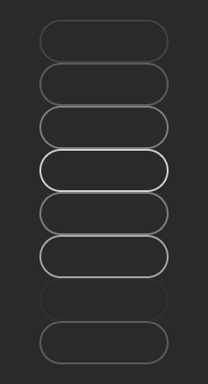
The ToggleButton uses an image as a background, more specifically a sprite that contains frames for each of the button states.
The frames are mapped to the ToggleState enum:
// Express one of the visual states a toggle can be in.
enum ToggleState {
    resting, // the initial state
    hovered,
    pressed,
    checked,
    checked_and_hovered,
    checked_and_pressed,
    disabled,
    checked_and_disabled,
}
You can replace the default_toggle_button_image with your custom image which should also have eight frames for each of these states. You can of course reuse some of the frames if you don't need to visually differentiate between all eight states. In this example the new image styles the ToggleButton as an outline button:
After you create your custom image file, place it in an assets folder in your project:
Resources/komplete_scripts/
    main.kscript
    assets/images/
        custom_toggle_button.png
        custom_toggle_button_@2x.png
    kontakt_controls/...
    style/
        my_styles.kscript
    scripts/
        main.txt
Then you can use the Image Asset class to create an image using your file. You can add the image variable to the existing style definition file.
import { default_toggle_button_style, ImageAsset } from kontakt_controls

var custom_toggle_button_image = ImageAsset(
    path: "assets/images/custom_toggle_button.png",
    width: 72,
    height: 24,
    frame_count: 8,
    fixed_left: 12,
    fixed_right: 12,
    fixed_top: 12,
    fixed_bottom: 12,
)

export var custom_toggle_button_style = default_toggle_button_style
Note that here you need to provide the size-related values based on the size of your image asset, so the number of pixels you set for width, height, fixed_left, etc may be different than in this example.
And then use this image in your custom ToggleButton style, by overriding the default.
import { default_toggle_button_style, ImageAsset } from kontakt_controls

var custom_toggle_button_image = ImageAsset(
    path: "assets/images/custom_toggle_button.png",
    width: 72,
    height: 24,
    frame_count: 8,
    fixed_left: 12,
    fixed_right: 12,
    fixed_top: 12,
    fixed_bottom: 12,
)

export var custom_toggle_button_style =
    default_toggle_button_style.overriding(fun(style) {
        style.image = custom_toggle_button_image
})
Here is the ToggleButton using a custom image:
Alternatively, if you would want to create a style that doesn't make use of any of the defaults, you would start by creating a new instance of ToggleButtonStyle. In this case you would not call overriding on the default style, but instead call the constructor of ToggleButtonStyle directly.
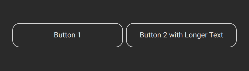
Width, Height and Padding
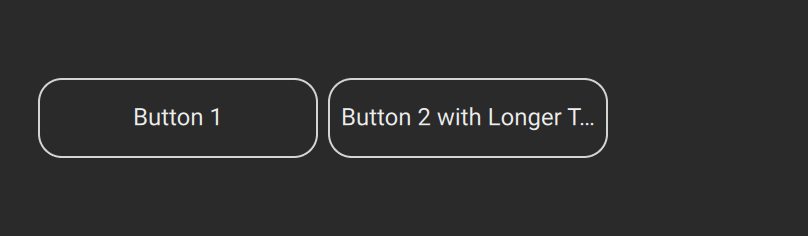
When you set a text on the ToggleButton, the component uses a NinePatchImage as a background. This means that you can set a width and/or height to customize the size of the component. For example, if you have multiple buttons and you want them to have the same size, you can update the style to use a fixed width and height. Here is how two of these buttons would look like in an HStack. In this case even if the first one has a shorter text, the size is constant:
export var custom_toggle_button_style =
    default_toggle_button_style.overriding(fun(style) {
        style.image = custom_toggle_button_image
        style.width = 180
        style.height = 40
})
If however, you'd like the size of the buttons to be driven by the text length and size, then you can customize the text padding value to set the space between the text and the button borders, as shown below.
import { EdgeInsets } from kontakt_controls

export var custom_toggle_button_style =
    default_toggle_button_style.overriding(fun(style) {
        style.image = custom_toggle_button_image
        style.padding = EdgeInsets(horizontal: 18, vertical: 15)
})
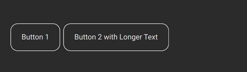
You might want to add padding also in the case of fixed width and height. This can ensure that the text is not displayed close to the borders of the ToggleButton, and avoid outcomes like the following:
export var custom_toggle_button_style =
    default_toggle_button_style.overriding(fun(style) {
        style.image = custom_toggle_button_image
        style.width = 140
        style.height = 40
        style.padding = EdgeInsets(0)
})
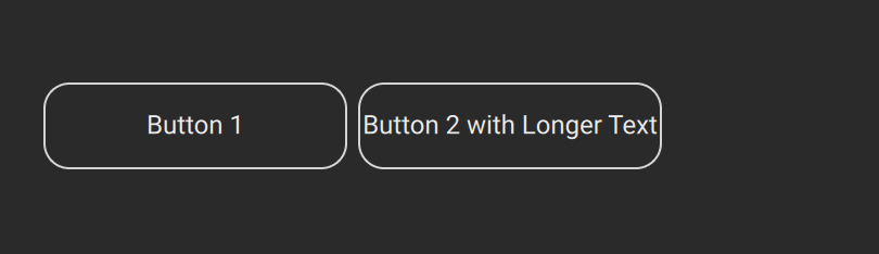
Instead, with a padding value set, the text will elide when it does not fit:
export var custom_toggle_button_style =
    default_toggle_button_style.overriding(fun(style) {
        style.image = custom_toggle_button_image
        style.width = 140
        style.height = 40
        style.padding = EdgeInsets(4)
})
Text properties
You can also tweak the text-related properties which provide a lot of styling options. To use a new font, simply load the font files and then update the font_family value to map to your font:
export var custom_toggle_button_style = default_style.overriding(fun(style) {
        style.font_family = custom_font // create your custom_font beforehand
})
Other text-related properties are highlighted below:
import { Alignment, font_weights } from ui
import {
    default_toggle_button_style,
    EdgeInsets,
    ImageAsset,
    ToggleStateColors
} from kontakt_controls

var custom_toggle_button_image = ImageAsset(
    path: "assets/images/custom_toggle_button.png",
    width: 72,
    height: 24,
    frame_count: 8,
    fixed_left: 12,
    fixed_right: 12,
    fixed_top: 12,
    fixed_bottom: 12,
)

export var custom_toggle_button_style =
    default_toggle_button_style.overriding(fun(style) {
        style.image = custom_toggle_button_image
        style.width = 100
        style.height = 40
        style.font_weight = font_weights.bold
        style.italic = true
        style.text_size = 20
        style.text_colors = ToggleStateColors(
            resting: Color(0xFFC780FF),
            hovered: Color(0xFFB24DFF),
            pressed: Color(0xFFB24DFF),
            checked: Color(0xFFB24DFF),
            checked_and_hovered: Color(0xFFB24DFF),
            checked_and_pressed: Color(0xFFB24DFF),
            disabled: Color(0xFFC780FF),
            checked_and_disabled: Color(0xFFC780FF),
        )
        style.text_alignment = Alignment.center_left
})