Slider
The Slider component is the Komplete UI representation of a KSP ui_slider.
component Slider
Example
import { Slider } from kontakt_controls

export var main = Slider(
    control_id: "my_slider",
    label: "My Slider",
)
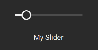
Behaviours
- holding
Shiftwhile dragging enters a "finetuning mode" that can be configured viafine_step_count - clicking while pressing
Ctrl(Windows) /Cmd(macOS) resets the slider to its default value.
Constructor
constructor(control_id: String, label: String, step_count: Int? = nil, fine_step_count: Int = 1, style: SliderStyle = default_slider_style, label_value_source: LabelValueSource = LabelValueSource.ksp_control_value, value_to_string: ValueFormatter = default_value_formatter, sensitivity: Float = 1, disabled: Bool = false)
control_id: StringThis is the name that you assigned to the corresponding KSP
ui_knobcontrol.label: StringThe text to display when the control is resting. Typically, a descriptive name for the control.
step_count: Int? = nilThe number of steps from the slider's
minto itsmaxvalue (both as set in KSP). Leaving it at its default of nil means that the step count will default to a step size of 1.infoPlease note:
- If you specify a step count that is bigger than
max-minit will be clipped to that number. - If you specify a step count that does not result in an integer step size, the step count will be adjusted to the nearest number that results in an integer step size.
- If you specify a step count that is bigger than
fine_step_count: Int = 1The number of sub-steps that each step (as defined by the step_count property) is divided into when pressing
Shiftwhile dragging.style: SliderStyle = default_slider_styleControls the visual appearance of the slider.
See SliderStyle for more details.
label_value_source: LabelValueSource = LabelValueSource.ksp_control_valueThis property controls the source of the value that is being displayed in the slider's label while dragging.
LabelValueSource.ksp_control_valuemakes the slider grab the value directly from the connected KSP control. This value can then further be formatted using thevalue_to_stringproperty.LabelValueSource.ksp_label_propertymakes the slider use the text displayed in the KSP label associated with the slider control.
value_to_string: ValueFormatter = default_value_formatterConverts the value to a string to be displayed in the label when the user interacts with the control. This property is ignored when label_value_source is set to
LabelValueSource.ksp_label_property.By default simply shows the raw integer value of the control.
sensitivity: Float = 1How sensitive the control responds.
When set to 1 one can move over the entire value range by moving from the leading edge to the trailing edge in the drag axis.
disabled: Bool = falseDisables all user interaction when
true.Disables all user interaction when
true.
Additional Information
In KSP it is relatively common to use a ui_slider to implement a control that is visually a knob. You can do this with the Slider as well:
import { Slider, default_knob_style } from kontakt_controls

export var main = Slider(
    control_id: "my_slider",
    label: "My Slider",
    style: default_knob_style,
)