Stepper
Control the value of a KSP ui_value_edit
component Stepper
Example
import { Stepper } from kontakt_controls

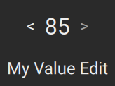
export var main = Stepper(
    control_id: "my_value_edit",
    label: "My Value Edit",
    default_value: 50,
)
Constructor
constructor(control_id: String, label: String, default_value: Int, text_previous: String? = nil, text_next: String? = nil, step_count: Int? = nil, fine_step_count: Int = 2, sensitivity: Float = 0.1, style: StepperStyle = StepperStyle(), value_to_string: ValueFormatter = default_value_formatter, disabled: Bool = false, on_editing_changed: (Bool) -> () = fun (editing: Bool) {}, policy: TriggerPolicy = TriggerPolicy.on_down)
control_id: StringThe name of the KSP control.
label: StringThe label to display when the control is resting.
default_value: IntThe default value to reset to with CTRL/CMD+Tap (temp, until we can fetch it from ui_value_edit).
text_previous: String? = nilText for the previous button, if any.
text_next: String? = nilText for the next, if any.
step_count: Int? = nilDetermines the number of steps it takes from min to max.
Uses the finest resolution when set to nil.
fine_step_count: Int = 2Divides the steps further for fine tuning when "shift" is pressed. 1 means no fine-tuning.
sensitivity: Float = 0.1How sensitive the control response is.
When set to 1 one can move over the entire value range by moving from the leading edge to the trailing edge in the drag axis.
style: StepperStyle = StepperStyle()Customizes the appearance of the Stepper.
See StepperStyle.
value_to_string: ValueFormatter = default_value_formatterConverts the value to a string to be displayed in the label when the user interacts with the control.
By default simply shows the raw integer value of the control.
disabled: Bool = falseDisables all user interaction when true.
on_editing_changed: (Bool) -> () = fun (editing: Bool) {}Called when the user starts or ends interacting with the control.
policy: TriggerPolicy = TriggerPolicy.on_downStepping on pointer down or up with the up and down buttons. For more details, refer to TriggerPolicy.